
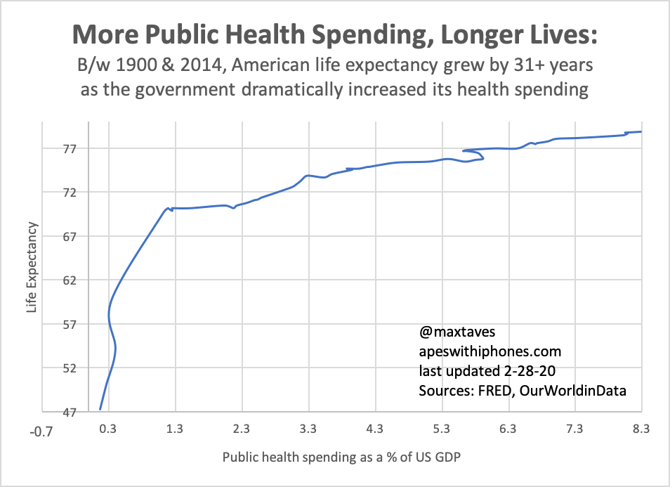
More public health spending in the US b/w 1900 & 2014 has correlated closely (and, I hope, obviously) with longer lives in the US.
Years of life gained= some kind of function of √Public health spending per GDP.
In other words, how many more years of life we deliver our citizens increases as the square root of the percent of total GDP we devote to public health).
In other other words, we can’t spend our way into living forever, so the longer our citizens live the more investment is required to add more life.
I’ll let the chart do the rest of the talking (for now). Please know the X axis is public health spending per GDP not time.
